
Print Checklist!
Before you send your artwork to print, make sure everything exactly how you want it to be! We have compiled a print checklist to help you make sure your i’s are dotted and your t’s are crossed!
No fuzzy edges!
Make sure all the images you use are a minimum of 300 dpi and that you haven’t enlarged them anymore than roughly 140%. This ensures your images are crisp. There is nothing worse than promoting your products with pixelated images!
Are your contact details correct?
Thanks Captain Obvious! But really – this is so, so important! Imagine your potential client getting a bounce-back email because you have a typo in your email address. A big Oops!
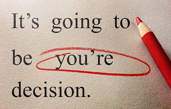
Has the text been checked and double-checked for spelling and typos?
Again, so obvious, but it’s amazing how many people don’t do a spellcheck! In addition to the normal spellcheck, read though your copy, and get someone else to do it, too! Another set of eyes always helps, especially if they are grammar Nazi’s!
Is it bleeding?
Do any images or elements in your design flow to the edges of your page? If so you will need 3mm bleed, which basically means they need to overflow the edge of your page by 3mm. If you’re still confused, check out our tip here. When you export your file to a PDF, make sure your crop marks are turned on, so you can see if the bleed is there.
Clear or confusing?
Is your message to your customers clear and easy to understand? Try and keep colours and fonts in order so it doesn’t overwhelm your reader. See our tips on fonts here.
Remember your printer is not your proof-reader, so check it and check it again! And when you get a proof, check that, too! For more tips & tricks, sign up to our newsletter!