How to Design a Brochure

Brochures are one of the best printed marketing materials you can get. A powerful connection to your customers, they provide a space that tells the story of your business and what you can do. Whether you hand them out at trade shows, or send them in the mail, you can be confident you can connect with your new customer in an instant.
Content – what do I need in my brochure?
Before you start on the design, you need to get your content sorted. When writing your text, the three most important points you need to include are:
- About Us. Use this intro to focus on one or 2 key qualities you want customers to focus on. It might be your high quality service, fast turnarounds or cost effective prices.
- What you do. Collate the important information you want to promote and split them into sections so it is easier for your reader to follow. Short sentences or bullet points will make it quicker to read and get your point across.
- Contact Details. (Duh). This is pretty obvious, but just make sure you include all methods of contact such as social media as well as the normal avenues. You might even want to include your opening hours.
Images
Select a few of your very best business images. These may be your products, or even some staff members. Just make sure they are good quality. Same goes for your logo. You will need to include this somewhere on your brochure, so make sure it is clear and high resolution.
Should my brochure be a tri-fold or bi-fold?
Before you get to ahead of yourself, decide if you would like a tri-fold or bi-fold. If you have a lot of text, a tri-fold brochure would be best, so you can split it up over the pages. However, if you are showcasing large images, a bi-fold might be more suitable, so you can use the space available. Mock up your brochure and try roughly sketching out how the information will be distributed. It will make it a bit easier to decide on the best format.
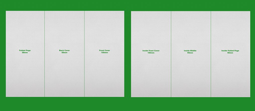
Remember that if you are doing a tri-fold, not all panels are the same size, as the folded page needs to fit inside the covers. See below for our cheat sheets.

What paper is best for a brochure?
Choosing the right paper can make a huge difference to your business message. Perhaps you are a business dedicated to sustainability? In which case you should consider a recycled stock. For more tips on paper, read our blog here.
Fonts & colours
Don’t get carried away with too many fonts and colours. They can confuse the reader and make it too overwhelming to read your message. Stick to your corporate colours of your business (most likely your logo colours) to keep it clean. Fonts should also be kept to one or two at the most, and if you are using script fonts, test them to ensure they letters are legible at a small size. For more information on fonts, have a look at our facebook post here.
With these few tips, you should be well on your way to designing an amazing brochure for your business. And don’t forget, we are here if you need help or have any questions!
Have fun!

