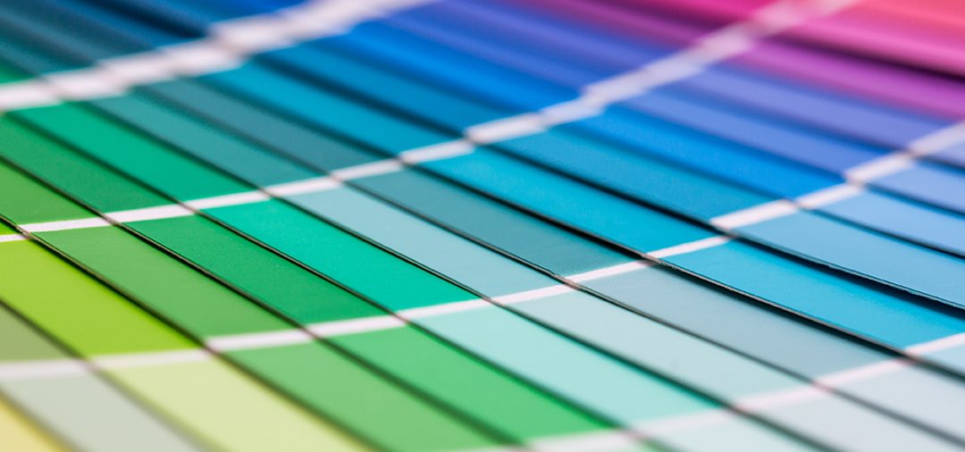
What are the best colours to use?
Colour is an important factor when connecting with your customers and can be used to build a strong brand. But what colours are right for your business? All colours have associations, and knowing the basics of each can help you portray the right message to your audience.
GREEN
Our favourite colour here at created2print. Green is directly related to nature, so is perfect when your brand is connected with sustainability, like ours is. It is also the easiest colour on the eye, so you it can be a powerful colour to make your brand stand out without it being overwhelming. Green also promotes health and endurance, luck, money and safety.
RED
How many SALE signs do you see that have red on them? This is no coincidence. Not only is it a powerful colour that attracts attention it stimulates people into making quick decisions, resulting in impulse buying. Red is also associated with love and passion and high danger.
BLUE
Blue is connected with the mind and body and promotes calmness. If your product is related to the sky or water, blue is an appropriate colour to use. It is an appetite suppressant, so not an ideal colour for promoting food. Blue is also deemed as a masculine colour, and very well received amongst males.
YELLOW
The closest colour to the sun, yellow is associated with happiness and summer. An attention grabbing colour, it stimulates the mind, however, overused it can have a detrimental effect, so be careful not to use too much in a design. Yellow is the best colour to use next to black, as it is the highest contrasting colour, hence why it is used for warning signs.
PINK
Pink is highly associated with femininity, so naturally perfect for a female audience. It promotes love and playfulness, so perfect for any age. Its also a good colour to highlight any important messages in your promotion.
ORANGE
A perfect colour to attract attention, but not quite as harsh as red. Orange is associated with creativity, success and adventure, so a fun colour to add to your promotion if this is part of your message. Orange is associated with healthy food and stimulates appetite.
BLACK
Black can be striking, and is a very popular colour in retail, as it is associated with power and sophistication. A prestigious product can be enhanced by using black with a gold or silver foil. However it is also quite a negative colour, associated with death and fear. Too much black in a background can also reduce readability, so be careful not to use too much.
Overall there are so many different associations with colour, and finding the right one for your business can really promote your message in a positive way. If you’re unsure on what’s best for your business, give us a shout and our graphic designers will give you a hand!